Avera.
Client: Avera Health
my ROLE: Web designer | Frond-End Developer | UX strategist
A primary goal of the Refresh Project was to allow for more flexibility with building out pages & creating layouts using different section sizes, colors, & components that can move throughout the page as needed to display content. The client also wanted a fresher, more modern design to embody joyful experiences, embracing a healthy lifestyle using purposeful white space & strong imagery. Part of the project was to design & develop a new sitewide header and footer to simplify the user journey and alleviate accessibility errors for users navigating the site via keyboard tabbing. Many client conversations, UX audits, & team collaboration took place as part of the process.
website homepage before:
new site | mobile view:
new homepage design:
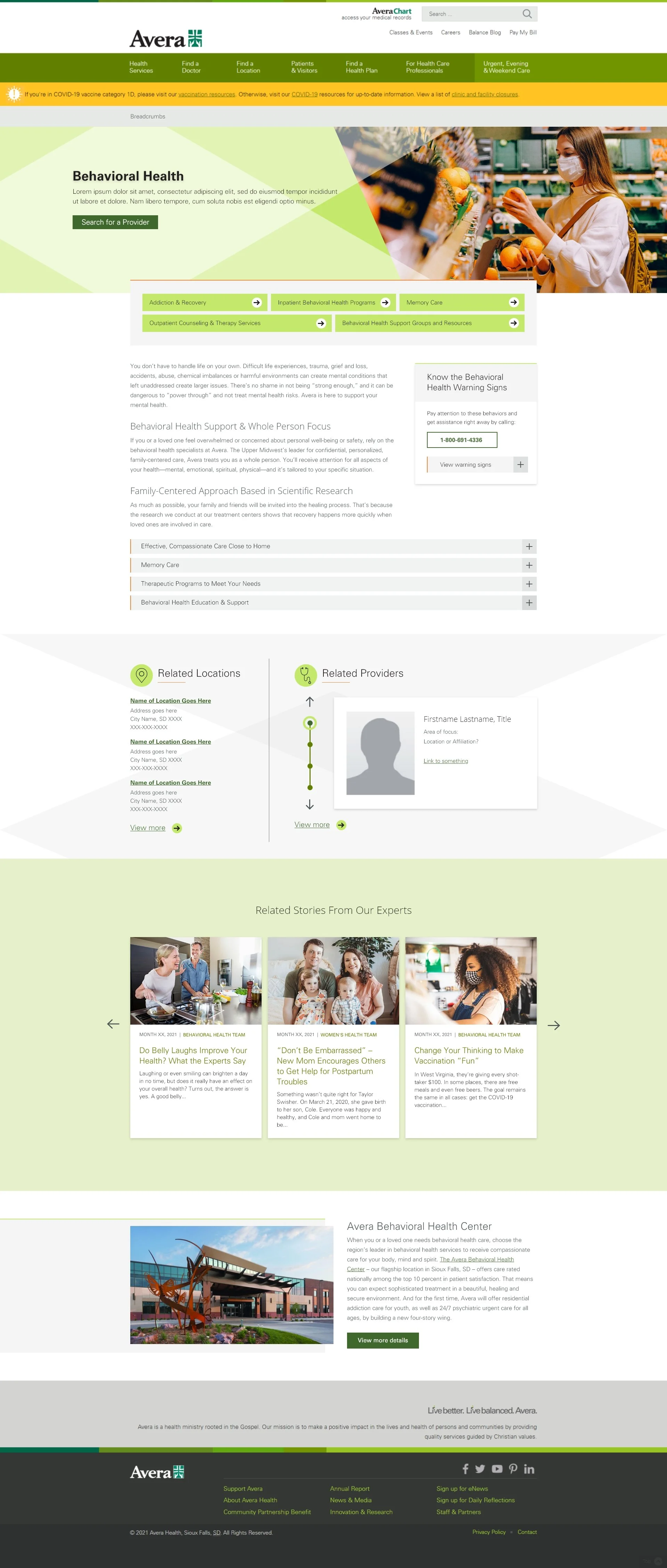
Research & Service Line Template
The Research & Services project was an initial step towards the flexibility Avera is wanting to acheive with their templates & building out pages. This project required one template design with a flexibile layout best suited for the needs of both Research & Service Line pages. Both sections needed to educate target audiences about participation opportunities & increase patient volume.


